
PTE Bank team analysed all of Describe Image Questions which are repeatedly showed in recent PTE exams (January – June 2021), and here are some of them.
1. Litchfield Population
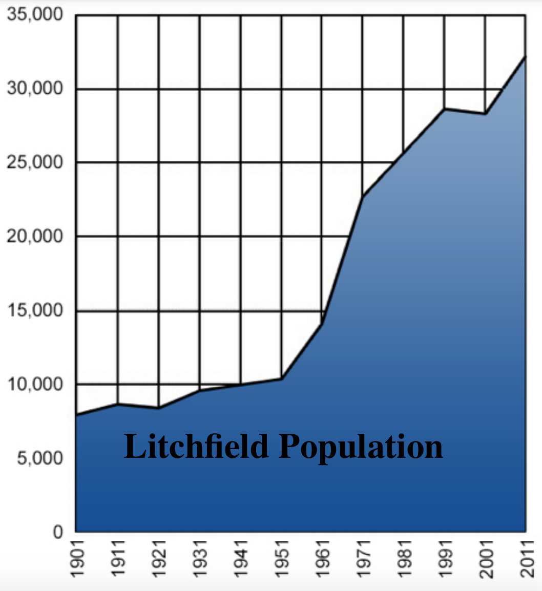
PTE Describe Image Sample Answer – Litchfield Population
This graph contains the information about the population of Litchfield from 1901 to 2011. The information is shown in a line and the population is shown by the blue-shaded area under the line. It starts at about 7500 in 1901 and gradually increased to about 10,000 in 1951. After that, the population increased much more rapidly and reached about 22,000 in 1971. The increase slowed down later and concluded at about 24,000 in 2011. There was a slight decrease from 1991 to 2001. In conclusion, the graph provides significant information about the population of Litchfield.
2. Air Composition
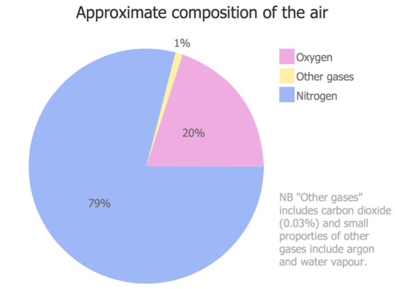
PTE Describe Image Sample Answer – Air Composition
The pie chart represents approximate composition of the air. As we can see from the chart there are oxygen, other gases, and nitrogen in the atmosphere. In addition, Nitrogen is the first most abundant gas in the atmosphere which occupies 79%, flowing by Oxygen which is 20%. In terms of other gases, it includes carbon dioxide, argon, and water vapour have proportion of 1%. In conclusion, the chart is very useful since it clearly shows the composition of the air.
3. Renewable Energy

PTE Describe Image Sample Answer – Renewable Energy
The picture gives information about renewable energy from different sectors such as heating and cooling, transport and power. In terms of heating and cooling, the total energy consumption in London is 51% which includes 10% of renewable energy. In addition, there is 32% of total energy consumption comes from transport, which only covers 3% of renewable energy. Lastly, 17% of energy is used by power, while it produces 26% of renewable energy. In conclusion, the major sector for renewable energy is power.
4. Internet Users

PTE Describe Image Sample Answer – Internet Users
The bar chart shows information about Internet users who accessed via a mobile phone in 2011 by different age groups. As we can see from the chart, the youngest age group constitutes the highest proportion which is about 70%. However, the lowest percentage is from the age group of over 65 years which is only 8%, following by the age group of 55 to 64 years which is around 20%. In conclusion, the main users who accessed internet via a mobile phone is the age group of 16 to 24 years.
5. Ship Lock

PTE Describe Image Sample Answer – Ship Lock
The picture gives information about how a ship lock works and how the process is done. As we can see from the picture, the dam and lock system is used for lowering ships between water of different levels. The ship gets through a waterway by going into a lock, which is a big chamber in the water with moveable gates at each end. Then the boat continue into the next lock, until it reaches the end of the system. The locks enable river vessels to go down a river from upstream to downstream. In conclusion, the picture is very informative.
For more information related to PTE Question Bank, click on Describe Image Templates to achieve 79+
-

 $35.00
 -
 $79.00
 -
 $59.00
PTE exam question bank for June 2026
Latest PTE exam question bank Are you preparing for the…
Group Project – PTE Summarize Group Discussion
Complaint in Library – PTE Summarize Group Discussion
PTE exam question bank for April 2026
Latest PTE exam question bank Are you preparing for the…